Daily Transactions and Unique Addresses - Polygon 🌐
Q1. Count and plot the number of daily transactions and unique addresses on Polygon, beginning July 1, 2022
1. Introduction 🟣
1.1 Context
Polygon is an EVM¹ (Ethereum Virtual Machine) and PoS² (Proof of Stake) Blockchain. Polygon is also known as “Ethereum’s internet of blockchain” because one of its purpose is to be a layer-2 scaling³ solution for Ethereum ecosystem, allowing users to perform almost the same interactions in Ethereum, but much cheaper and faster. E.G. The block-time on Polygon is 2s compared to 10s on Ethereum. Access for more informations.
1.2 Objective
The main mission of this dashboard is to count and plot the number of daily transactions and unique addresses on Polygon, beginning July 1, 2022. We want to know if Polygon is growing or decreasing. In order to do that, we will use advanced tools to create a predictive model.
2. Methodologies 🧪
2.1 Metrics and Data Source
To compute daily transactions and unique addresses overtime, it was used the polygon.core.fact_transactions table, and the
flipside_prod_db.polygon.transactions to retrieve data from more than 1 month ago.
2.2 Tools
We used the ShroomDK 🍄 and Jupyter Notebook to develop advanced analysis, such as regression analysis and statistical inference. All codes used to generate charts are in the GitHub Repository

3. Conclusion 🟣
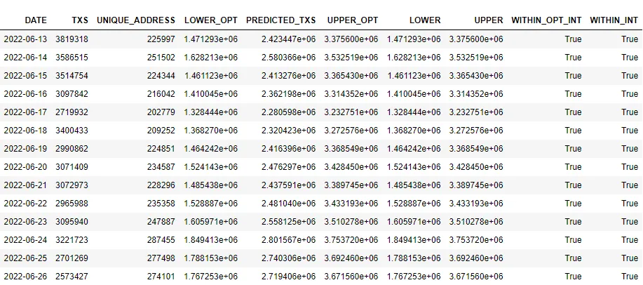
We can conclude that unique addresses and daily transactions are showing a downward trend since Jul 1. The two variable have a strong positive correlation, and can be used to predictions purposes. To predict exactly a variable is extremely hard, even for experienced scientists and statisticians. That’s why we set a prediction interval to ensure daily transactions values predicted from the model will fall into a value range given a certain confidence. We tried to build a more robust model with a dynamic prediction interval, considering Txs variance across unique addresses. However, the last table showed that both models predicted daily transactions from the test dataset would be within the prediction interval: WITHIN_OPT_INT and WITHIN_INT
There’s no significant difference between the two regression models at the end of the day. We have a good predictive tool to figure out daily Txs given Unique Addresses.
Discussion
-
It was used data from 2022-02-12 to 2022-06-11 to train the regression model and data from the last 30 days beginning Jul 13, 2022 to test the model.
-
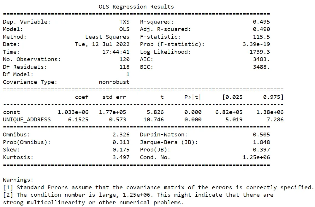
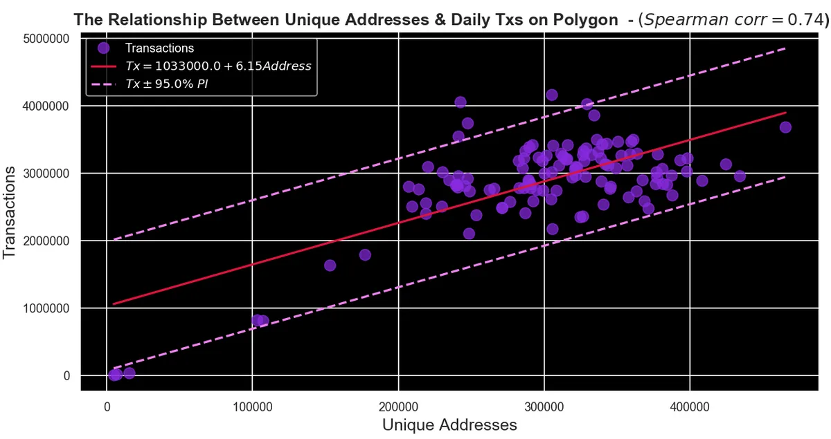
The Correlation between the variable is 0.74. It’s a strong positive correlation.
-
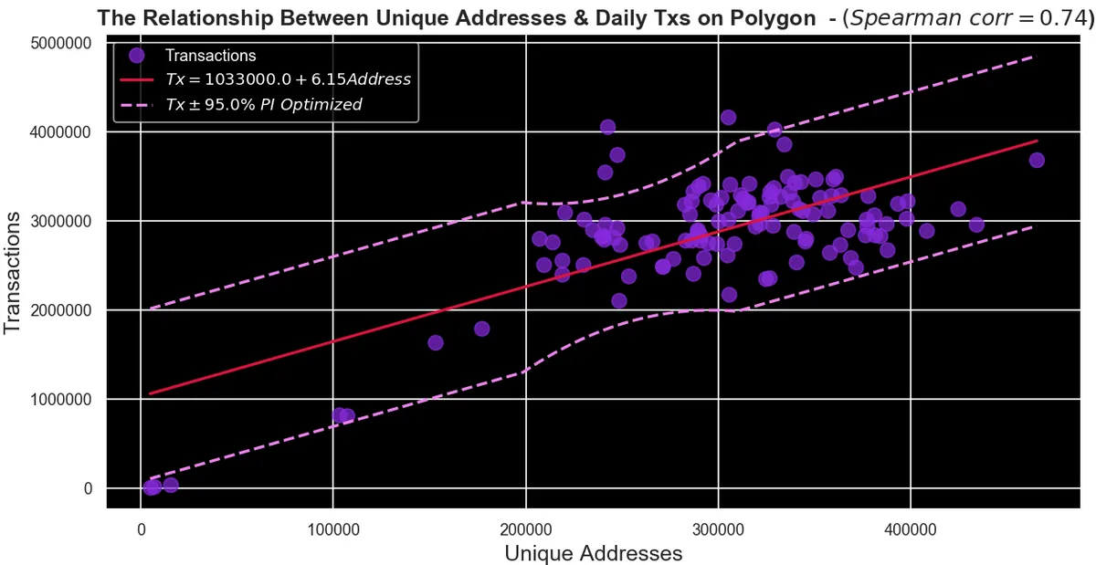
The approximation curve is described by
Tx = 1033000 + 6.15 Addresses, in which Tx is daily transactions and Addresses is Unique Addresses. The pink curve is called prediction interval, and it means that we have 95% of confidence the values predicted by the model will be within the upper and lower band (interval). -
In the OLS regression results, we can see a R-Squared of 0.495. This means 49.5% of the Unique Addresses variable can be explained by the Daily Transactions using our model.
-
Take a look at Kurtosis and Skew in the regression report. Theses numbers are close to kurtosis and skewness of a normal distribution, saying to us the dataset meets requirements to build a good linear regression curve.
-
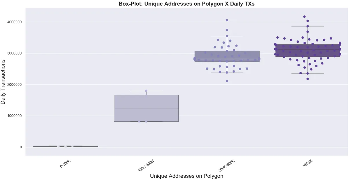
We tried to build a more robust regression (last regression chart), making the prediction interval to consider the variance of Daily Txs across Unique Addresses (shown in the box-lot chart).
\
Discussion
We can easily see that both unique addresses and daily transactions are decreasing since Jul 1, 2022. Their moving average (black curve) are indicating a downward trend. We also can notice through the scatterplot that the relationship between unique addresses and daily transactions is clearly positive