Make a scatterplot showing the relationship between ENS price and the number of airdrops claimed.
Loading...
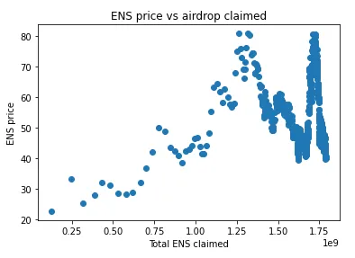
The following chart shows the amount of airdrop claimed vs the ENS price, in which it can be seen how as more amount of airdrop claims the lower is the ENS price.
If we do a scatterplot between ENS price and cumulative airdrop tokens claimed, we can see how the chart is different. Below, we can see how the ENS price rise even though the airdrop claimed rise as well. Then, the chart experiments big fluctuations due to bear market conditions I guess.