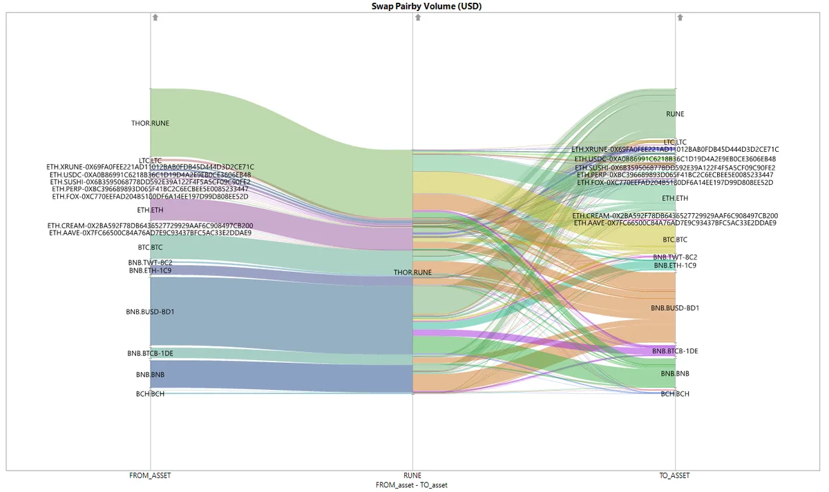
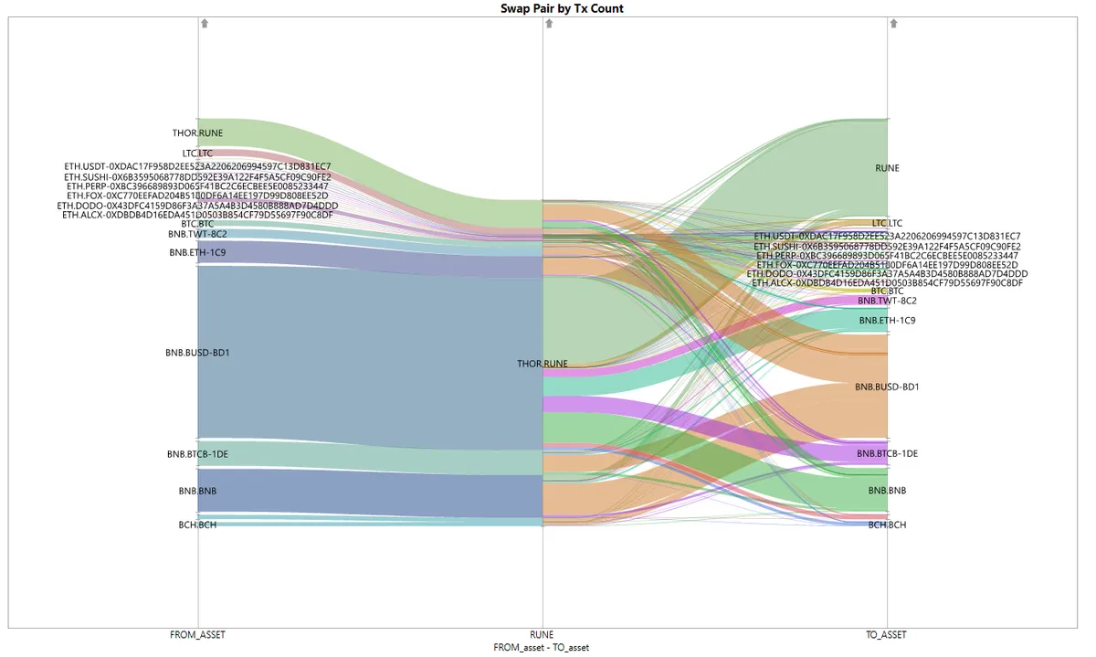
THORChain: Sankey Swap Diagrams

    In this dashboard, I'm using JMP Statistical software to visualize the swap pairs transactions distribution for the past 30 days.

    The graph below shows the Sankey Diagram for the swap pair by volume USD. On THORSwap, users can swap native asset to another native asset on another blockchain. How THORChain works is that it enables different blockchain to connect to THORChain so native Asset A has to be swapped to native $RUNE and then the $RUNE will be swapped to Asset B.

    From the diagram above, we can see that most of transaction coming from BNB.BUSD. And destination asset is a tie between native $RUNE and BNB.BUSD stablecoin. It is suprising to see that quite a lot of people swapping for $RUNE this past month.

    If we take a look by transaction count, the initial asset was dominated by BNB.BUSD and $RUNE seems to be the highest destination asset.

    APPROACH:

    1. Query transaction to $RUNE and transaction from $RUNE seperately and combine.
    2. Rows with match on transaction ID considered transaction to $RUNE only.
    3. Plot graph with from_asset, THOR.RUNE and to_asset at x-axis and volume USD/transactions count at y-axis using JMP.

    Raw Data: here

    db_img
    db_img
    db_img