Flipside Terra Console Analysis
This dashboard aims to improve the Flipside Terra console by looking at what chart may not be accurate anymore and suggesting new charts that could be added.
Introduction
The Flipside Terra Console is a dashboard developed by Flipside and is powered by the Flipside community to provide Community Enabled Analytics (CEA). This means that all the charts in the console were built by the Flipside Community. It provides numerous insightful charts, from operational data like such as the total number of users of Terra, to financial data such as the Daily Total Fees collected by Terra.
This dashboard aims to improve the console by looking at the accuracy of the charts and providing suggestions for charts that could be added to the console.
Accuracy
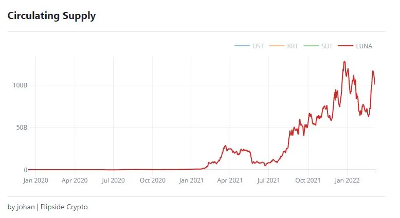
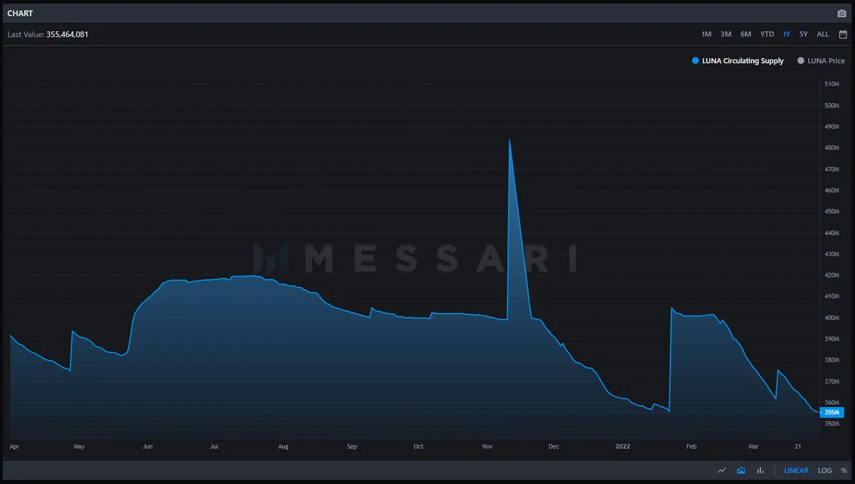
As for Accuracy, the only chart that seems to be way off is the chart for the circulating supply of LUNA. The chart in the console seems to suggest that the current circulating supply is around 100B. This is obviously wrong. One chart that is commonly referred to as the correct chart for the circulating supply is on messari.io, which suggest that the current circulating supply of LUNA is around 355M.
Definition
To check the charts on the console for accuracy, the chart was simple compared to charts that are known to be correct. Examples of sources of correct charts are:
For example, the chart for cumulative total users on Terra seems to be correct, as it matches the chart for cumulative total wallets on the Terra Station.
Unfortunately, not all charts on the console could be checked, as the same chart does not appear on one of the sources above. For example, Monthly Active Users is not available on one of the sources above.
Completeness/Usefulness
In this section, we will discuss charts that can be added to the console, to improve completeness and usefulness for new users.
-
Volume Chart
Currently, there is no clear volume chart available in the console. There is this chart but I could not figure out how to read this chart. I would suggest adding a simple volume chart for at least LUNA and UST, just like the one in the Terra Station. I think volume is a very important indicator, also for beginners, as it shows interest in the asset. Low volume usually means low interest, while high volume usually indicates high interest. -
Staking ratio over time
Currently, there is no chart for the staking ratio for LUNA over time. This chart would show the percentage of all LUNA that is currently staked. This chart would be important as it would show the trust in the LUNA coin, right now and in the past. If the staking ratio would be high, it would show higher trust in LUNA as users are willing to stake it and therefore not sell it in the short term. -
Suggestion for chart improvement
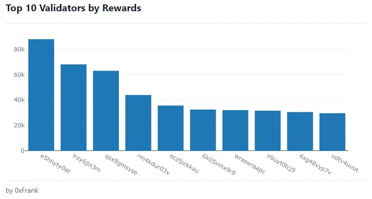
Finally, I would like to suggest a change to an existing chart in the console. The chart below, which show the top 10 Validator by Rewards, currently shows the operator address of the validator on the x-axis. This is not very good way to represent the validator. I would suggest changing the x-axis by the validator name, instead of the address. This way it is more clear which validators are represented in the chart.
Conclusion
The current Flipside Terra Console is quite complete. I was only to find one chart that was clearly wrong, which was the chart for the circulating supply of LUNA. Furthermore, this dashboard provided two suggestions for new charts that could be added to the console: A chart for daily volume for LUNA and UST like the chart in the Terra Station, and a chart that shows the staking ratio of LUNA over time. Finally, a suggestion was done to improve the Top 10 Validators by Rewards chart. This chart currently represents the validators by address. I suggested this could be changed to the validator name to make the chart more accessible.