LUNA Burn vs UST Supply
This dashboard aims to visualize the amount of LUNA that has burned and the supply of UST over the last 30 days.
Introduction
Why are we visualizing both the amount of LUNA burned and the supply of UST? This is because they are correlated. Let's find out how.
It mainly comes down to this: in order to mint 1 UST, 1 UST worth of LUNA has to be burned. This means that when demand for UST increases, the amount of LUNA that has to be burned increases as well. These 'tokenomics' are one of the reasons the price of LUNA is increasing so much over the last few days. Because of the current uncertainty, many users switch back to stablecoins. This increases demand for UST. As said, when demand for UST increases, more UST has to be minted resulting in more LUNA being burned. The burning of LUNA results in a reducting of the supply of LUNA which in turn should drive up the price if demand for LUNA is constant.
In green, we the daily supply of UST. In blue, we see the cumulative burned LUNA over the last 30 days. We can see that right around mid-February, the supply of UST increased quite drastically. We can also see that the amount of LUNA that was burned increased accordingly.
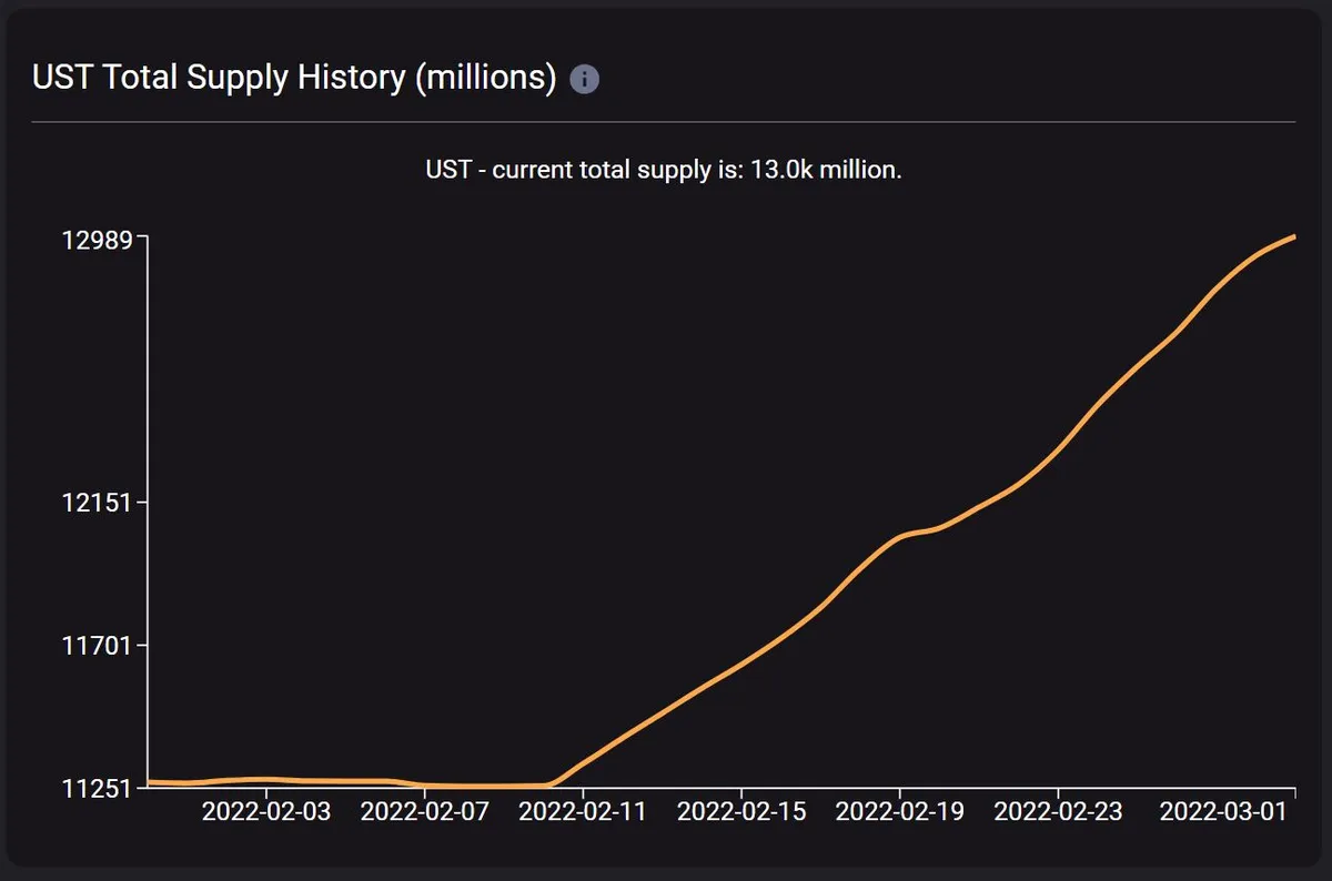
For completeness, I have also added the UST supply graph from https://terra.smartstake.io/. This graph is seen as the reference by the community. We can see that our chart (apart from some jagged edges) lines up quite nicely.
Methods
How did we calculate the UST supply and cumulative burned LUNA?
The UST supply was calculated by simply summing over all the UST balances per day in the daily_balances table.
The amount of LUNA that was burned was calculated using the terra1vs9jr7pxuqwct3j29lez3pfetuu8xmq7tk3lzk address. This contract address is used to mint and burn UST and LUNA. To get the total amount of LUNA burned, we sum the amount of LUNA that was used to mint new UST for each day.