Terra Dashboard Analysis
This dashboard aims to provide a summary of the dashboard I submitted for the Acme of Skill bounty. This bounty aimed to show the current health of the Terra ecosystem using a number of metrics.
Introduction
This dashboard aims to provide a summary of the dashboard I submitted for the Acme of Skill bounty. This bounty aimed to show the current health of the Terra ecosystem using a number of metrics. In this dashboard, we will also look at the effectiveness of the metrics and possible additions I could make to the dashboard to improve it.
Summary
The dashboard is made using Google Data Studio and contains four main pages:
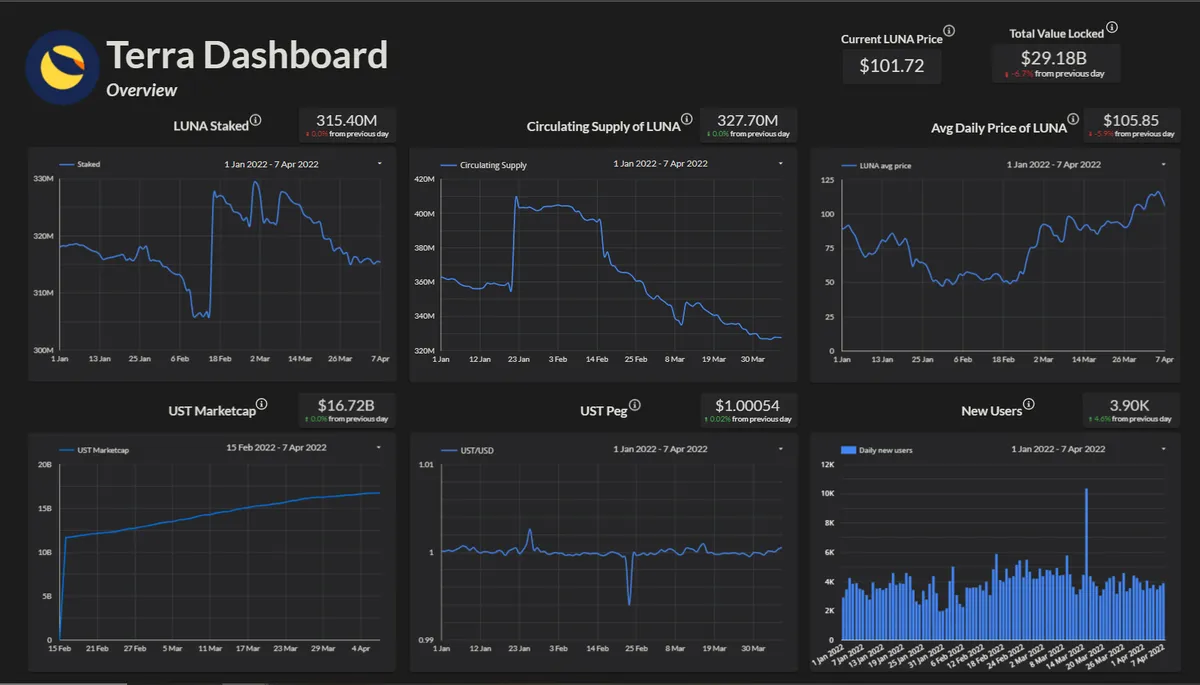
- Overview: This page contains some core metrics that indicate the health of the Terra ecosystem in one place. The Overview page can be seen in the image above. I believe it lists the 6 most important metrics for the Terra ecosystem: the price of LUNA, the circulating supply of LUNA, the amount of LUNA staked, the UST marketcap, the UST peg and the number of daily new users.
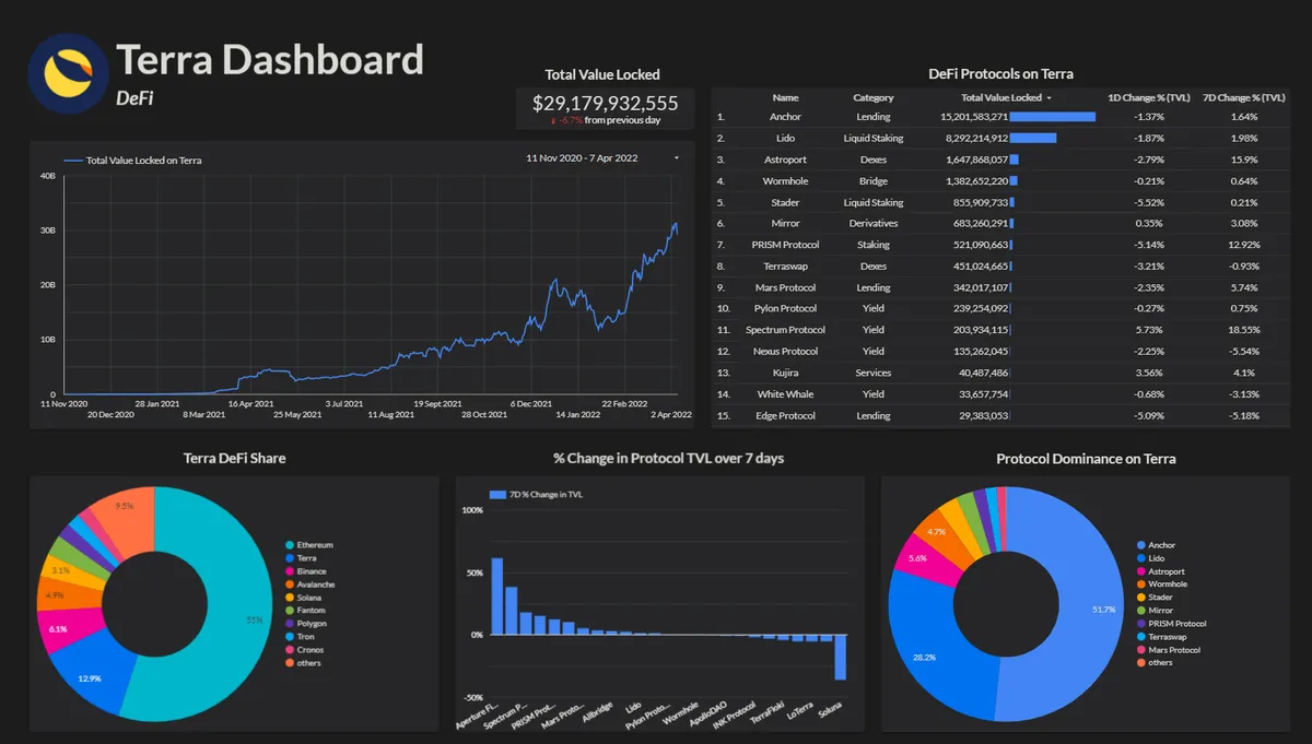
- DeFi: This page contains metrics about the current state of DeFi on Terra. There is a table that lists the current protocols on Terra ordered by TVL, a chart of the Total Value Locked on Terra over time, a donut chart that compares the TVL of Terra to other ecosystems, a bar chart that lists the 7-day percentage change in TVL for each protocol on Terra and finally the protocol dominance on Terra.
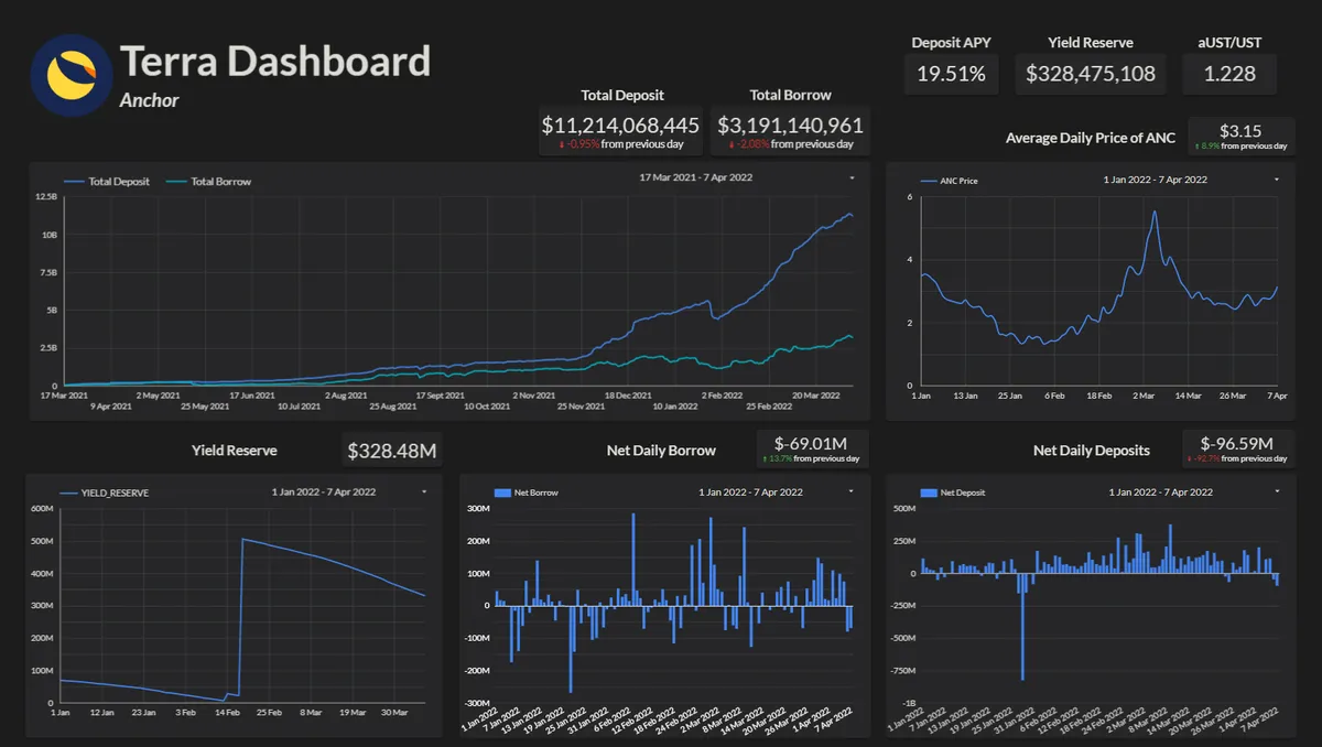
- Anchor: This page lists metrics for the largest protocol on Terra. Important metrics are the Yield Reserve, the total deposits and total borrow over time and the price of the ANC token. The net daily borrow and net daily deposits are also listed to provide insight into the daily growth of the protocol.
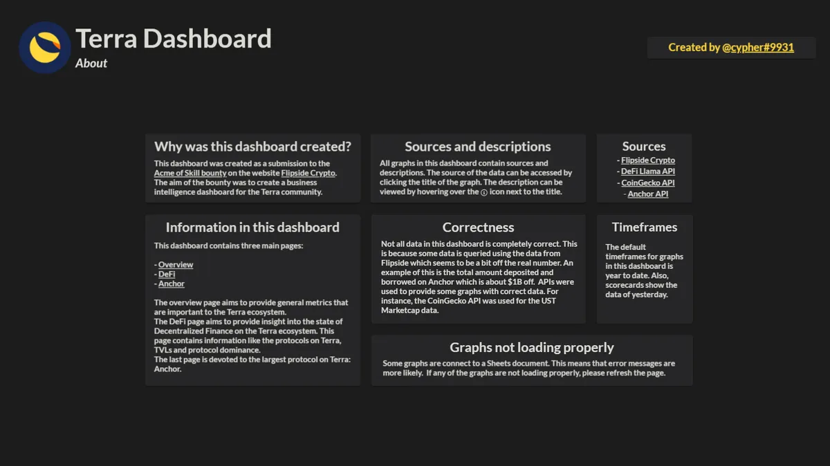
- About: Finally, the last page provides some information about the dashboard.