Web3 Analytics 101 Live Course | 28 November 2022 | Segment 3: Building Blocks
About Web3 Analytics 101 Live Course
This course teaches students how to understand and analyze blockchain data using SQL. In the live course format, you will learn in real time with a cohort, and receive NFT badges and xMETRIC for your achievements.
About This Dashboard
This dashboard is used for Segment 3 in the Web3 Analytics 101 Live Course, and builds up more SQL, visualization and dashboarding skills. Here you will dive deeper into date & time filtering, learn about using GROUP BY, HAVING, CASE, CTEs, and JOINs, as well as about visualizations and dashboard best practices.
Find Out More 👇
- Join our Discord community and check out the #education-chat channel!
- MetricsDAO Website
- YouTube

- What dates exactly does “block_timestamp BETWEEN” include?
Admin
- Submit the xMETRIC form during this live (shared midway in chat)
- Submit the first quiz - deadline extended till tomorrow! November 29, 2022 at 2PM ET
- Submit the second quiz - available to enrolled students after today’s live, and due next week (December 6, 2022 at 2PM ET)!
- Attend weekly Office Hours
- Wednesday, November 30, 2022 9-10am EST
- This week in office hours: Answering any questions we don’t get to in the live, and Solving Bounties and Creating Dashboards.
- This dashboard is shared with the enrolled students on Discord
- Not enrolled? Sign up for the upcoming January live cohort in our Discord #education-info
- Questions welcome! If not answered live, you can take them to Discord and Office Hours
2.Slicing data with GROUP_BY
3.HAVING: The filter for GROUP BY slices
4.Slicing using datetime variables
5.Visualizing data and creating dashboards
Note the difference between these two functions: DATE() (converts data type to a date) and DATE_TRUNC() (does not change data type).
The chart on the right reveals that OpenSea platform fees varied on October 1, 2022.
The lowest hourly amount of fees was collected at 8AM UTC with 4,784 USD.
The highest hourly amount of fees was collected at 8PM UTC, yielding over 35,000 USD.
The only transaction currencies that brought in over 1,000 USD in hourly platform fees are ETH and wrapped ETH.
Of the two, most of the platform fees were in ETH.
WETH platform fee amounts stayed more stable than ETH. ETH platform fees are responsible for the large spike at 8PM UTC on October 1st, 2022.
6.Transforming inputs using CASE statements
8.Multiple CTEs with JOIN
7.Introducing Common Table Expressions (CTEs)
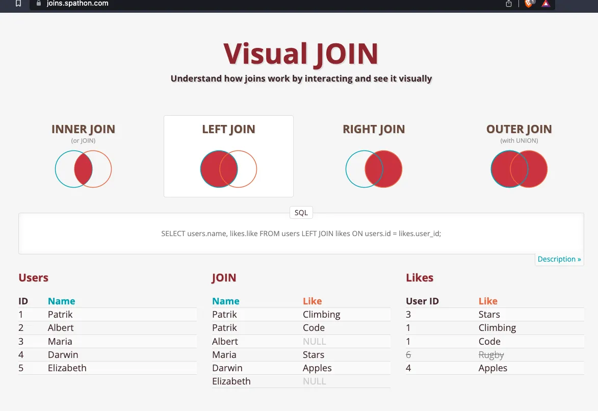
More about types of JOINs:
\
-
Frame the problem: give a brief overview to explain the issue at hand, and why it’s important to explore.
-
Lay out the key components of your subject of analysis: a blockchain or ecosystem, a protocol, an airdrop campaign, a liquidity pool, etc. Explain which part(s) of it your analysis will address. This helps situate the reader of your analysis and provide context.
-
Share important methodology notes and explain your analytical decisions.
- E.g. if you used the price of WETH as a proxy for the price of ETH, explain the issue you faced finding the price of ETH and why you decided these prices were equivalent for your purposes.
- If you made other methodological decisions like removing outliers etc., or found something unusual about the data, here is the place to mention it.
- This will help your audience understand your analysis better, and also help any analysts who would like to replicate or build upon your open-source analysis.
-
Emphasize the insights: What are some important, distinctive, and/or surprising findings you uncovered that your audience would care about?
- Did the amount of sales reduce in half from one month to the next?
- Did you find that most transactions happen in one token (or pool), when the platform has dozens of tokens?
- Did you discover that a particular type of user always did particular actions in the data you analyzed?
- Is this information you uncovered easily visible and understandable by someone who’s reading or skimming your work?
-
Tell a story with the dashboard structure, visualizations, and words.
- Imagine your introduction starts the story, and the end of the dashboard (conclusion, summary, or insights section) wraps it up with a logical conclusion.
- Think about your audience and what kind of data story they would find both compelling and actionable. This approach is much preferable to making your analysis sound either like homework (there was a requirement and it was met), or theoretical and inaccessible.
-
Make your visualizations understandable at a glance. Data viz is a medium for having a quick look at the findings, and humans grasp findings better from pictures than words. (Bonus: look into the data visualization best practices.)
-
Share your analysis! Remember those insights in #4? Time to emphasize them for the world to see! There are many ways to share your work, and Twitter is one of them -- here are some tips.
💡 Want inspiration? Read up on some of the best of the best dashboards submitted before at MetricsDAO, and what the authors did well, in our Stellar Submissions blog series: Edition one, two, three, four, five, six, seven, eight.

9.What makes a ‘good’ dashboard?
While creating a compelling analytics dashboard can be an art as much as a science, here are some building blocks you can incorporate 👇
You made it in Segment 3, woohoo! 🎉
Remember to:
-
submit your live session attendance for some xMETRIC,
-
take quizzes to earn your progressive on-chain badges,
-
start to solve educational bounty assignments (for more xMETRIC and to become part of the best dashboard competition!),
-
join Office Hours for questions and to learn more about bounty-solving,
-
and ask questions in MetricsDAO discord (#live-course if you are an enrolled student and #education-chat otherwise)!
\
See you for Segment 4, where Sam will dive into intermediate web3 data analytics 📈